So... as I was watching the live blogs of Apple's "Let's Rock" event this afternoon, I realized that, while I would love to blog on a daily basis, I lack both the time and the motivation to do so. This isn't to say that there will never be another blog entry here - if I have something valuable to post and the time to write it, I certainly will. However, with a full class load, working part time, and maintaining a house this year, my time seems entirely sapped by my day to day activities. On top of this, about 95% of the things I think to write about are variations on other bloggers' posts, and considering blogging is what some of these people do for a living, I generally feel that they cover topics better than I can with the limited amount of time I once had to write this blog.. so there's not a whole lot of motivation to be the 100th blogger to tell you about the new iPod nanos, touches, classic, etc.
Hopefully this blog was enjoyable for those who read it, and if I find the time and/or topics I feel the need to write about, this will be the place I go. Just file techtelic into the back of your RSS reader, and hopefully there will be a time where this blog will continue.
Thanks for reading!
Tuesday, September 9, 2008
Tuesday, August 5, 2008
Stuff I Use: Simplify Media
Having multiple computers can become a major issue with different versions of documents and files on each computer. Most people have at least two if not more computers between home and work. As a computer tech, my work computer changes more often than most. I like to have at least some of my multimedia collection with me so that I can listen to music or have a movie on in the background as I work, but transferring this data from one computer to another and keeping track of what media is where is a time consuming and annoying task that I'd rather just not deal with.
The solution I've found is a program called Simplify Media. It allows users to share all of my media on a computer at home, and allows users to access that media from any other internet connected computer. Most solutions this versatile require a decent amount of technical knowhow such as opening ports on your router or hosting the files online, but Simplify Media allows users to access any file in iTunes on a home computer as if it were shared on the local network at work, and does it simply and easily.
The program does not allow users to modify or create new playlists from the remote machine, but all of the normal abilities users have with shared libraries apply for libraries shared via simplify media. To get started, simply create an account with Simplify Media http://www.simplifymedia.com/, download the free application (Mac or Windows) on each computer you'd like to share media on, and sign in with iTunes open on each computer. Simplify media will automatically connect users with other computers that the user has approved to share media. This will allow access to any media in your iTunes library from any remote machine you approve.
Monday, July 14, 2008
Point & Shoot Shootout, The Perfect Camera to Buy and Why
About a month ago, I realized that the case on my Canon SD800 IS camera was coming a bit loose. I figured that it was just from such heavy use as my daily camera for over two years, but didn't do anything to fix it. That turned out to be a bad idea, because dust was able to get into the camera through the loose case, and each picture I took had nice bits of dust captured along with the rest of the image. This basically ruined every picture, freckling each with little dark spots all over the place, so I decided it was time for an upgrade.
I searched the web and my local camera stores for the best replacement, but first I had to figure out what is most important to me for a point and shoot camera.
These things are:
•Speed
•Ease of Use
•Small Size
•Crisp Pictures, both indoor and out
•Video Quality
These qualifications won't fit every user, but as a secondary camera to my D80, and as something that has to fit comfortably in my pocket, these requirements were fitting. Here are a few cameras that I came up with that fit these specifications and would be sufficient to replace my beloved SD800.
Canon PowerShot SD1100 IS
Nikon CoolPix S600
Sony CyberShot DSC-T2
Samsung NV24 HD
Each of these cameras had their advantages, but I ended up with the Canon SD1100 IS because it fit my requirements almost perfectly. Second place was the Nikon S600, but as I will explain, it didn't meet my qualifications as well as the Canon SD1100, not to mention that it is $50 more expensive.
As for the others...
The Sony had the same issues that Sony cameras had when I was purchasing my SD800 IS, namely inaccurate white balance. Sony makes great cameras, and the shots they take are decent for the most part. However, in my experience, the point and shoot cameras lack the brilliant and accurate colors that Canon's are known for. In my brief in store testing with the DSC-T2, the SD1100 outperformed this smaller, lighter camera, offering more consistent, clearer images with more accurate color.
The Samsung turned out to be a one trick pony, although its trick is a very cool one - 720p high definition video recording. I take a surprising amount of video with my digital cameras, and I couldn't get my hands on a demo model, but other reviewers have commented on its lack of consistent image quality while taking regular photos as well as lack of speed. Both of these drawbacks held this from being my camera of choice as well.
But now onto the top two, and why I ended up with the Canon over the higher spec'd Nikon.
First, the SD1100 is quick. When a friend is laughing hysterically with blue icing all over his teeth, I want to be able to pull my camera out and capture the moment quickly and clearly, so speed is a necessity. A quick stopwatch timing shows that the camera takes a bit over a second and a half from completely off to taking a picture with no flash. The SD1100 also manages to keep up between shots, taking less than a second between each to snap a second, third, fourth, fifth, and sixth picture, all within five seconds of the initial shot. The Nikon competitor advertises that it's "stunningly fast," and it's definitely quicker than most cameras I've used at about one frame per second continuous shooting. However, the Canon struck me as quicker from the start and boasts a slightly quicker 1.3 fps spec.
The ease of use was also a huge detractor from the Nikon where the Canon excelled. Granted, ease of use is a subjective judgement and I've owned and used a Canon almost exclusively for almost two years, but my first two cameras were Nikon point and shoots, so, in theory, both should be equally intuitive for me. Canon seems to have further refined their user interface into a smooth and logical way to operate the camera whereas the Nikon seemed to be more complicated and more difficult to figure out. For example, switching the camera from shooting mode to video mode is a simple slider on the back of the Canon, where the nikon requires going into the modes menu, rotating the selection ring, settling on the video shooting mode, and then pressing okay. Overall, the Canon seemed much more logical in its button layout and was simpler to use.
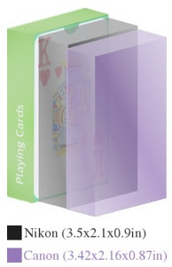
The Canon and Nikon are within .2 in all dimensions and weight, so for all logical comparisons, the two are the same size. Both are smaller than the SD800 IS and felt about the same in my pocket. The Nikon was .2 oz heavier, but that's a miniscule difference and wasn't enough to make a decision based on weight alone.
Here's a comparison of the Canon (purple) and Nikon (black) against a pack of playing cards:
What digital camera are you using, and what do you like/dislike about it most? Post in the comments!

I searched the web and my local camera stores for the best replacement, but first I had to figure out what is most important to me for a point and shoot camera.
These things are:
•Speed
•Ease of Use
•Small Size
•Crisp Pictures, both indoor and out
•Video Quality
These qualifications won't fit every user, but as a secondary camera to my D80, and as something that has to fit comfortably in my pocket, these requirements were fitting. Here are a few cameras that I came up with that fit these specifications and would be sufficient to replace my beloved SD800.
Canon PowerShot SD1100 IS
Nikon CoolPix S600
Sony CyberShot DSC-T2
Samsung NV24 HD
Each of these cameras had their advantages, but I ended up with the Canon SD1100 IS because it fit my requirements almost perfectly. Second place was the Nikon S600, but as I will explain, it didn't meet my qualifications as well as the Canon SD1100, not to mention that it is $50 more expensive.
As for the others...
The Sony had the same issues that Sony cameras had when I was purchasing my SD800 IS, namely inaccurate white balance. Sony makes great cameras, and the shots they take are decent for the most part. However, in my experience, the point and shoot cameras lack the brilliant and accurate colors that Canon's are known for. In my brief in store testing with the DSC-T2, the SD1100 outperformed this smaller, lighter camera, offering more consistent, clearer images with more accurate color.
The Samsung turned out to be a one trick pony, although its trick is a very cool one - 720p high definition video recording. I take a surprising amount of video with my digital cameras, and I couldn't get my hands on a demo model, but other reviewers have commented on its lack of consistent image quality while taking regular photos as well as lack of speed. Both of these drawbacks held this from being my camera of choice as well.
But now onto the top two, and why I ended up with the Canon over the higher spec'd Nikon.
First,
 the SD1100 is quick. When a friend is laughing hysterically with blue icing all over his teeth, I want to be able to pull my camera out and capture the moment quickly and clearly, so speed is a necessity. A quick stopwatch timing shows that the camera takes a bit over a second and a half from completely off to taking a picture with no flash. The SD1100 also manages to keep up between shots, taking less than a second between each to snap a second, third, fourth, fifth, and sixth picture, all within five seconds of the initial shot. The Nikon competitor advertises that it's "stunningly fast," and it's definitely quicker than most cameras I've used at about one frame per second continuous shooting. However, the Canon struck me as quicker from the start and boasts a slightly quicker 1.3 fps spec.
The ease of use was also a huge detractor from the Nikon where the Canon excelled. Granted, ease of use is a subjective judgement and I've owned and used a Canon almost exclusively for almost two years, but my first two cameras were Nikon point and shoots, so, in theory, both should be equally intuitive for me. Canon seems to have further refined their user interface into a smooth and logical way to operate the camera whereas the Nikon seemed to be more complicated and more difficult to figure out. For example, switching the camera from shooting mode to video mode is a simple slider on the back of the Canon, where the nikon requires going into the modes menu, rotating the selection ring, settling on the video shooting mode, and then pressing okay. Overall, the Canon seemed much more logical in its button layout and was simpler to use.
The Canon and Nikon are within .2 in all dimensions and weight, so for all logical comparisons, the two are the same size. Both are smaller than the SD800 IS and felt about the same in my pocket. The Nikon was .2 oz heavier, but that's a miniscule difference and wasn't enough to make a decision based on weight alone.
Here's a comparison of the Canon (purple) and Nikon (black) against a pack of playing cards:

Canons are best known for their abilities to capture amazing color and crisp lines in outdoor shots. The shot below, for example, was taken with my SD800 IS. My experience with prior Nikons was that they took fine pictures, but just lacked the definition that the Canons had. I read many reviews of both cameras to find any caveats that I may have missed during my testing. There were a few reviewers who noted that the Nikon took great pictures, but that they were "soft," where the Canon produced much more vivid images.
Both cameras pack optical image stabilization/vibration reduction which help with motion blur and shaky hands, but considering the Nikon takes soft images even in near perfect conditions, the Canon was definitely the winner here as well.


As 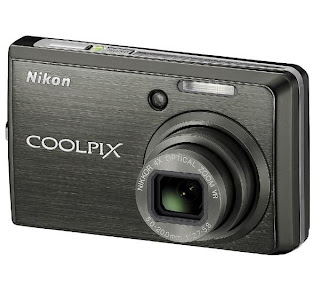 for video quality, both the Canon and the Nikon have the same video resolution and both utilize the optical image stabilization during recording. Neither camera was able to use optical zoom during video recording, but the digital zoom on the Canon was a smooth zoom whereas the Nikon had a choppy, incremental digital zoom. The audio on both seemed about the same as well, so the cameras tied this category.
 for video quality, both the Canon and the Nikon have the same video resolution and both utilize the optical image stabilization during recording. Neither camera was able to use optical zoom during video recording, but the digital zoom on the Canon was a smooth zoom whereas the Nikon had a choppy, incremental digital zoom. The audio on both seemed about the same as well, so the cameras tied this category.
Now, 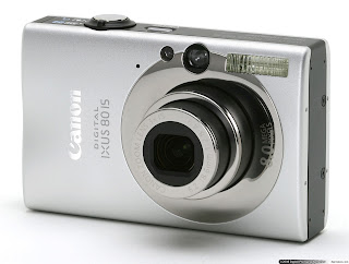
while the Canon won all of these comparisons, all while maintaining a $50 less expensive price point, you do get a few worthwile things for your money with the Nikon. First is a superior zoom, which is both wider angle and longer telephoto than the Canon's. This means that you can be closer to your subject and further zoomed out, or further from you subject and zoomed in closer than the Canon would be able to. The second thing is a marginally larger screen at .2" bigger, and while that may not seem like a huge amount, when it's 2.5" vs 2.7", there is a definite advantage to the larger screen. The Canon's superior user interface and vivid colors won me over, but Nikon has really improved their consumer cameras and I feel that the S600 would make for an extremely fine camera for a user that desired these features.

while the Canon won all of these comparisons, all while maintaining a $50 less expensive price point, you do get a few worthwile things for your money with the Nikon. First is a superior zoom, which is both wider angle and longer telephoto than the Canon's. This means that you can be closer to your subject and further zoomed out, or further from you subject and zoomed in closer than the Canon would be able to. The second thing is a marginally larger screen at .2" bigger, and while that may not seem like a huge amount, when it's 2.5" vs 2.7", there is a definite advantage to the larger screen. The Canon's superior user interface and vivid colors won me over, but Nikon has really improved their consumer cameras and I feel that the S600 would make for an extremely fine camera for a user that desired these features.
What digital camera are you using, and what do you like/dislike about it most? Post in the comments!
Sunday, July 13, 2008
Stuff I Use: Keyboard Maestro
The  newest generation of both desktop and notebook Apple keyboards have nifty media controls built into their layout. Simple play/pause, track forward, and track backwards keys may seem like trivial additions to the previous keyboard layout, but when you want to quickly skip a track you've heard a million times or repeat a track you love, it makes a huge time difference to have these keys handy as opposed to switching to iTunes and switching or pausing the song that way.
For those of us wanting the ability to use these quick keys, but have slightly older Apple computers, there is a program called Keyboard Maestro that allows users to assign key mappings that would otherwise be impossible without upgrading to newer hardware. The program is very simple to use and allows for keys to be mapped to various functions including application launching, running scripts, application control, and assigning keyboard shortcuts to menu commands in various applications.
My main use for Keyboard Maestro is to replicate the media control keys on the newer Apple keyboards. I use my F6 key for play/pause and my F7 key for track forward. F5 is used by volume up and F8 is used for spaces (although I rarely use spaces that way,) so those aren't up for direct use, but these two work well to get my keyboard functionality close to the way I want it.
Keyboard Maestro also helps to replicate some functionality from OS9 that I've been missing; keyboard application launching. In OS 9.2 I had my keyboard set up so that F1-F4 launched all the applications I used on a daily basis, and while OSX has made application launching a much more simple task, it's hard to beat the speed that a single button launch command offers. I now use F1 to launch iTunes, iChat, Apple Mail, and Safari with just one keystroke.
One last comment is that if you're on an Apple notebook, the function keys are mapped to various functions such as volume, screen brightness etc, so you have to either hold down the function key while pressing the keys you mapped or change the "Use all F1, F2, etc. keys as standard function keys" preference in the keyboard and mouse section of system preferences in order for your new mappings to work.
A free demo is available from the developer's website
Wednesday, July 9, 2008
3G iPhone, Can it Match The Hype of The First?
I was an apple employee when the first iPhone was released, and I can say that the device lived up to 95% of the hype. The first time I held the so called "Jesus phone" in my hand, I had an exuberant death grip on the new gadget, not wanting to give it up until I had played with every last feature. I was entirely overwhelmed by all the amazing things the iPhone could do, and thought it was the answer as far as a phone/iPod combination. Just as an iPod/phone replacement, I would have bought one, but Apple managed to add a slew of other features (including an amazing web browser,) sweetening the deal. I was extremely anxious to get my hands on one of my own.
However, I find myself completely unexcited about the iPhone 3G. There are a few reasons for this. First, the new iPhone doesn't offer any new revolutionary hardware features from the first; second, the price is misleading, and will ultimately cost consumers more; and third, a loss of the overlooked, but very important at home activation.
My "old" edge iPhone will get all the new software features, including application support. These new software features are the most important improvements between the original iPhone and the new 3G for this writer, and with wifi at my home, my work, and most friends houses, the new hardware supporting 3G really isn't that important. GPS is cool, but I already have a dedicated GPS device that stays in my car and is available whenever I might need it -- not to mention that if I receive a phone call while the GPS is navigating, it will continue to work normally without interruption.
In two days, the second coming of the iPhone will hit store shelves, and for half the price of the original! To me, Apple has gone against what they originally set out to do with the iPhone, and that is to make it worth something. Most cell phones have gotten to the point that they are almost disposable. The cell phone carriers subsidize their phones to sell phone service, and one of Apple's goals was to have an unsubsidized device. Obviously, they have given up that goal. I'm sure that's a sound business decision, and at the same time the consumers are paying a smaller initial price, but over the life of the iPhone, the increased cost of the data/voice plan will cause consumers to end up shelling out $160 MORE than they did over the life of the original iPhone.
The third thing is a bit less important, but is still something that was lost from the first iPhone -- at home activation. The original iPhone was the easiest phone to buy because you didn't have to open it in the store and activate it with the carrier. Instead, you just bought the phone, and took it home like any other device to be activated with your computer at home. On top of the fact that you could do it at home, the activation process was a lot easier and only required you to plug your phone in and have iTunes installed. The program recognized the iPhone and walked you through a very simple activation process. The new iPhone will require in-store activation, and while I'm sure Apple has figured out a way to streamline the process, it still won't be able to match up to the ease of the original.
I'm leaving out the little things like the fact that the iPhone's GPS will be UNABLE to provide turn by turn directions and that the battery life is significantly less than the original's (by 3 hours of data use), but at this point I'm just nitpicking and ignoring the positive things like the fact that users can now use data and voice at the same time or that web access will, in fact, be much faster.
I think I've ranted enough, but the new iPhone's lack of revolutionary new features (not that there was much to improve), the increased overall price (and the misleading tagline), and loss of at home activation just aren't encouraging reasons to upgrade.
 was an apple employee when the first iPhone was released, and I can say that the device lived up to 95% of the hype. The first time I held the so called "Jesus phone" in my hand, I had an exuberant death grip on the new gadget, not wanting to give it up until I had played with every last feature. I was entirely overwhelmed by all the amazing things the iPhone could do, and thought it was the answer as far as a phone/iPod combination. Just as an iPod/phone replacement, I would have bought one, but Apple managed to add a slew of other features (including an amazing web browser,) sweetening the deal. I was extremely anxious to get my hands on one of my own.
However, I find myself completely unexcited about the iPhone 3G. There are a few reasons for this. First, the new iPhone doesn't offer any new revolutionary hardware features from the first; second, the price is misleading, and will ultimately cost consumers more; and third, a loss of the overlooked, but very important at home activation.
My "old" edge iPhone will get all the new software features, including application support. These new software features are the most important improvements between the original iPhone and the new 3G for this writer, and with wifi at my home, my work, and most friends houses, the new hardware supporting 3G really isn't that important. GPS is cool, but I already have a dedicated GPS device that stays in my car and is available whenever I might need it -- not to mention that if I receive a phone call while the GPS is navigating, it will continue to work normally without interruption.
In two days, the second coming of the iPhone will hit store shelves, and for half the price of the original! To me, Apple has gone against what they originally set out to do with the iPhone, and that is to make it worth something. Most cell phones have gotten to the point that they are almost disposable. The cell phone carriers subsidize their phones to sell phone service, and one of Apple's goals was to have an unsubsidized device. Obviously, they have given up that goal. I'm sure that's a sound business decision, and at the same time the consumers are paying a smaller initial price, but over the life of the iPhone, the increased cost of the data/voice plan will cause consumers to end up shelling out $160 MORE than they did over the life of the original iPhone.
The third thing is a bit less important, but is still something that was lost from the first iPhone -- at home activation. The original iPhone was the easiest phone to buy because you didn't have to open it in the store and activate it with the carrier. Instead, you just bought the phone, and took it home like any other device to be activated with your computer at home. On top of the fact that you could do it at home, the activation process was a lot easier and only required you to plug your phone in and have iTunes installed. The program recognized the iPhone and walked you through a very simple activation process. The new iPhone will require in-store activation, and while I'm sure Apple has figured out a way to streamline the process, it still won't be able to match up to the ease of the original.
I'm leaving out the little things like the fact that the iPhone's GPS will be UNABLE to provide turn by turn directions and that the battery life is significantly less than the original's (by 3 hours of data use), but at this point I'm just nitpicking and ignoring the positive things like the fact that users can now use data and voice at the same time or that web access will, in fact, be much faster.
I think I've ranted enough, but the new iPhone's lack of revolutionary new features (not that there was much to improve), the increased overall price (and the misleading tagline), and loss of at home activation just aren't encouraging reasons to upgrade.
UPDATE: Looks like my concerns about the new in-store activation were just about right. iPhonealley.com has published an article quoting apple's VP in charge of retail, "Our expectation is that in 10 to 15 minutes, you'll be set up and ready to go,'' iPhone alley adds that [10 to 15 minutes] is significantly slower than the launch last June, which took only about 3 minutes per person to quickly go in, make the purchase, and leave.
Monday, June 30, 2008
To an 160 GB iPod Classic from a 60 GB iPod Video
Up  until a month ago, I had been using a 5th generation 60 GB iPod video. It served all the purposes I needed it to, except that I had over 60 gigs of music alone, and I wanted to store photos and videos on the iPod as well. When I had the money to buy a higher capacity iPod, I sold my iPod Video right before Apple's annual World Wide Developer Conference (WWDC), hoping that a new iPod might be announced at the event. No new iPod was announced, but I had already sold my Video, so I went out and bought a new 160 GB iPod Classic.
What I was expecting was nothing more than my old iPod with a higher capacity. What I got was a lot more than that. The new iPod offers a slew of small touches, both on the hardware and on the firmware running on the device.
The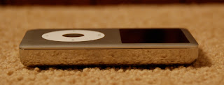 advantages on the hardware side are that the screen is brighter and crisper, the battery life is more than twice as long, and the iPod still manages to stay the same size while more than doubling capacity. On my older iPod Video, the screen had a high enough resolution to display the important items, but the newer screen is both brighter and higher resolution, allowing more information to be displayed on the screen at once. As for battery life, my Video stopped at around 12 hours of playing music, but the new Classic will play it for 30 hours. On top of all that, the dimensions of the devices are almost identical, other than the shape of the front edge is shaped slightly differently.
The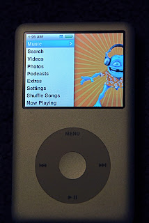 firmware improvements include a better method of displaying the time in the top menu bar, artist names listed under song names while viewing playlists, and an overall sleeker and more appealing look and navigation through my media. On the Video, the top menu bar was usually taken by the name of the playlist or navigation menu you were in, so trying to check the time in the top bar was a time consuming process. The newer firmware takes advantage of the higher resolution screen and displays the time constantly, regardless of what menu you're in. Another slight annoyance I had with the Video was that many artists have songs with the same name (for example, I have 9 different songs, all called "beautiful" and all by different artists). If these songs were in a playlist, I wasn't sure which of the songs I was choosing. Again taking advantage of the higher resolution display, the Classic displays the artist of each song when looking at a playlist. Lastly, the Classic really utilizes album art that is tied to the songs in my library. At each music menu, the menu options are on the left side of the screen while albums that are in the current selection are faded in and out on the right. This often provides me with something random but good to start listening to and makes for an interesting way to pick music (another thing that is always a task for me).
Overall, the new iPod fit my goal of storing all my media on one device, but also surprised me with a number of small fixes and improvements in the user interface. I would recommend anyone who also has a few annoyances with their older firmware or needs a higher capacity to upgrade, and with current iPods still worth a lot of money, the upgrade shouldn't be nearly as costly as the initial purchase.
Full Disclaimer: I was an employee of Apple Inc., but I am not one currently.

 until a month ago, I had been using a 5th generation 60 GB iPod video. It served all the purposes I needed it to, except that I had over 60 gigs of music alone, and I wanted to store photos and videos on the iPod as well. When I had the money to buy a higher capacity iPod, I sold my iPod Video right before Apple's annual World Wide Developer Conference (WWDC), hoping that a new iPod might be announced at the event. No new iPod was announced, but I had already sold my Video, so I went out and bought a new 160 GB iPod Classic.
What I was expecting was nothing more than my old iPod with a higher capacity. What I got was a lot more than that. The new iPod offers a slew of small touches, both on the hardware and on the firmware running on the device.
The
 advantages on the hardware side are that the screen is brighter and crisper, the battery life is more than twice as long, and the iPod still manages to stay the same size while more than doubling capacity. On my older iPod Video, the screen had a high enough resolution to display the important items, but the newer screen is both brighter and higher resolution, allowing more information to be displayed on the screen at once. As for battery life, my Video stopped at around 12 hours of playing music, but the new Classic will play it for 30 hours. On top of all that, the dimensions of the devices are almost identical, other than the shape of the front edge is shaped slightly differently.
The
 firmware improvements include a better method of displaying the time in the top menu bar, artist names listed under song names while viewing playlists, and an overall sleeker and more appealing look and navigation through my media. On the Video, the top menu bar was usually taken by the name of the playlist or navigation menu you were in, so trying to check the time in the top bar was a time consuming process. The newer firmware takes advantage of the higher resolution screen and displays the time constantly, regardless of what menu you're in. Another slight annoyance I had with the Video was that many artists have songs with the same name (for example, I have 9 different songs, all called "beautiful" and all by different artists). If these songs were in a playlist, I wasn't sure which of the songs I was choosing. Again taking advantage of the higher resolution display, the Classic displays the artist of each song when looking at a playlist. Lastly, the Classic really utilizes album art that is tied to the songs in my library. At each music menu, the menu options are on the left side of the screen while albums that are in the current selection are faded in and out on the right. This often provides me with something random but good to start listening to and makes for an interesting way to pick music (another thing that is always a task for me).
Overall, the new iPod fit my goal of storing all my media on one device, but also surprised me with a number of small fixes and improvements in the user interface. I would recommend anyone who also has a few annoyances with their older firmware or needs a higher capacity to upgrade, and with current iPods still worth a lot of money, the upgrade shouldn't be nearly as costly as the initial purchase.
Full Disclaimer: I was an employee of Apple Inc., but I am not one currently.
Monday, June 23, 2008
TechTelic Tip: More Finder Keyboard Shortcuts

I love discovering new neat things on my mac, and today I stumbled upon OS X's built in clipboard switcher which allows for multiple copies and pastes to be saved and accessed at any time.
You can access the clipboard switcher by adding the shift key to the normal cmd+c or cmd+v keyboard shortcuts. To add a new clipboard entry to the manager, just select the text you want to copy and press cmd+shift+c. To paste, select where you want the text/image to be pasted and then double click which copy you would like pasted.
A few other finder keyboard shortcuts that I also discovered today are:
instant access to the Applications folder: cmd+shift+A
instant access to the Utilities folder: cmd+shift+U
instant access to the Desktop: cmd+shift+D
and my personal favorite,
instant google search of selected text: cmd+shift+L
UPDATE:
A recent machints.com article adds that you can also drag selected text to the safari icon in your dock to perform an instant google search
http://www.macosxhints.com/article.php?story=20080619191307294
Subscribe to:
Comments (Atom)
